
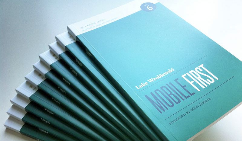
Ok, você já se convenceu que a Web é mobile (Desktop será a exceção :), já acorda pensando em mobile, e acha design responsivo a última bolacha do pacote. Mas falta ver boas práticas e dicas de como atacar a nova Web. Conheça o excelente livro "Mobile First".
Comprei o livro no combo junto com o "Responsive Web Design" do Ethan Marcotte -- aliás, excelente preço, $15 os dois ebooks. Assim como os outros livros da A Book Apart, Mobile First é focado, curto e rápido de ler -- veja também meu review do livro "Responsive Web Design".
É um livro de boas práticas de usabilidade, design e conteúdo para mobile. Não há código -- o que achei bom --, apenas dicas e análises do autor sobre vários aspectos do desenvolvimento Web mobile e Desktop. A premissa básica que você já vê pelo título é que deveríamos começar nossos sites por mobile primeiro. As restrições e limitações do mundo móvel são uma boa coisa para nos ajudar a priorizar conteúdo, otimizar o site, e focar no que realmente é importante.
Eu gostei bastante desse livro, mais até que do "Responsive Web Design" do Ethan Marcotte. É um livro básico mas não óbvio, com várias sacadas que te fazem pensar melhor seus designs mobile. Um desenvolvedor iniciante consegue acompanhá-lo, e um mais experiente certamente irá aproveitar vários pontos.
Luke Wroblewski começa destacando as vantagens de ir mobile first com excelentes argumentos. Trata das restrições comuns dos smartphones e tablets, e também das suas capacidades únicas -- como geolocalização, sensores e câmeras. Depois, parte para aspectos práticos de mobile sobre organização de conteúdo, como lidar com ações e input de usuário, e como organizar o layout da página.
Separei algumas excelentes passagens detacadas durante minha leitura no Kindle, começando pela minha favorita:
If your start to hear customers asking for your desktop web experience to be more like the simple, easy-to-use mobile one -- you're doing it right.
Mobile first é bom pra todo mundo
If you design for mobile first, you can create agreement up front on what matters most. You can then apply the same rationale to the desktop [...]. If you can agree on the most important set of features and content for your customers and business, why should that priorization change with mode screen space?
Anything that can be done to increase performance on mobile should be done. At the highest level that means sending less stuff and using whichever browser and server technologies are available to you to speed things up.
If you focus on mobile first and make things fast enough for spotty mobile networks, your websites and applications will be blazingly fast on the desktop and your customers will love you for it -- just another advantage to embracing mobile constraints up front.
Any actions that rely on mouse hovers in our desktop web experiences need to be rethought--and that's a good thing. Many uses of hover actions on the web assume too much. Just because someone places their mouse cursor over something doesn't mean they are asking for a pop-up menu of actions and options.
Não corte conteúdo
Customers will expect to do just about everything (whitin reason) on mobile. Especially those who primarily (or only) use their mobiles to get online. So don't dumb things down on mobile -- focus on what really matters most anywhere people can access your website.
When reflecting on a lot of mobile usage patterns, I like to imagine people as "one eyeball and one thumb". One thumb because they are likely to be holding their mobile in one hand and using a single thumb to control it; one eyeball because in many locations where mobile devices are used we only have people's partial attention.
While the time and place people interact with mobile may be different, the core value of your website stays the same. So once again, don't deny people content and features just because they're on a mobile device.
Dicas de UX
As a general rule, content takes precedence over navigation on mobile. [People] want immediate answers to their needs and not your site map.
On mobile, your options for on-hover menus are: on screen, on tap/swipe, on a separate screen, or (my favorite) gone for good.
While navigation menus fixed to the bottom of the screen might be a good idea in some native mobile applications, the variable presence of web browsers menus and physical controls below the screen on mobile device means they are often a poor idea in mobile web experiences. If you need a fixed menu better to fix it to the top.
Human fingers are imprecise pointing instruments: they lack the pixel-level accuracy of a mouse pointer; they come in different sizes; and it's not uncommon for them to slip or move around as we interact with our devices. Bigger actions mean bigger touch targets
Since the majority of people are right-handed [...] primary actions can be placed in the middle or bottom of the screen and arranged from left to right.
[The core gestures for mobile experiences are] tap, drag and swipe.
Device experiences
Consider the differences between connected TVs, desktop/laptops, tablets, smartphones and feature phones. Each of these devices experiences has a unique common user posture, primary input method and average display size.
Device experiences can also be useful for thinking through how each break point in a responsive web design solution should not only look but act as well. Layout and media assets can be adjusted to make the best use of available screen space and to optimize for specific input capabilities.
The right combination of device experience-specific designs, responsive web design, and fluid interfaces can ensure your mobile web experiences work on today's mobile devices and beyond.
Priorização de conteúdo
Reduction is the best layout approach available to you on mobile. [...] Across all your mobile layouts, aim for the minimum amount necessary to help people meet their needs.
Embracing constraints (rather than fighting them) will ultimately get you to better designs.
Não deixe de ver também meu review do livro Responsive Web Design do Ethan Marcotte, uma excelente companhia para esse livro.